Statistics Page
Many websites with personalized user accounts offer different stats to keep users informed and engaged. The statistics page visualizes various data, usually in charts, numbers, and tables to make it easier to scan and analyze. Sure, it is a good idea to integrate typical patterns well-known by users as this way the cognitive load is reduced and it makes stats perception more user-friendly. One of the classic examples of such a pattern is using red color for negative changes and green color for positive changes in the user’s stats.
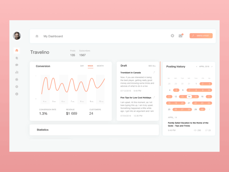
Blog dashboard page showing various statistics