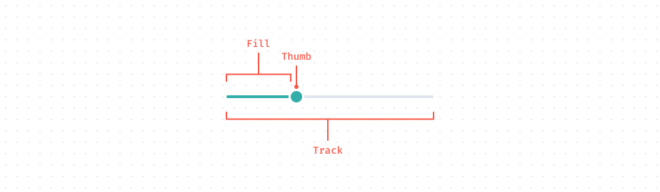
Anatomy
Sliders provide a visual indication of adjustable content, where the user can increase or decrease the value by moving the handle along a horizontal track.
- Possible Names: Slider, Range, Range Slider, Range Input
- Grouping:
input
Properties
| Property | Value | Default Value | Is Required? | DESCRIPTION |
|---|---|---|---|---|
| min | number | 0 | No | Sets the minimum allowed value. |
| max | number | 100 | No | Sets the maximum allowed value. |
| step | number | 1 | No | A value determining how much the value should increase / decrease by moving the thumb by mouse. |
| value | number | - | No | Initial value for the slider. |
Stencil
Layers structure
Slider.comp
├── Thumb.frame
│   └── vector.vector
├── Fill.frame
└── Track.frame
HTML Structure
BEM
<div class="Slider">
  <!-- Track -->
  <div class="Track"></div>

  <!-- Fill -->
  <div class="Fill" style="width: 45%"></div>

  <!-- Thumb -->
  <div role="slider" aria-label="Slider" aria-valuemin="0" aria-valuemax="100" aria-valuenow="70" aria-orientation="horizontal" class="Thumb" style="left: 40%"></div>
</div>
Tailwind
<div class="h-1 w-full relative">
  <!-- Track -->
  <div class="h-1 w-full absolute rounded-full bg-gray-200"></div>

  <!-- Fill -->
  <div class="h-1 absolute top-0 left-0 rounded-full bg-green-500" style="width: 45%"></div>

  <!-- Thumb -->
  <div role="slider" aria-label="Slider" aria-valuemin="0" aria-valuemax="100" aria-valuenow="70" aria-orientation="horizontal" class="-top-2.5 left-20 w-6 h-6 absolute rounded-full bg-green-500 border-4 border-white cursor-pointer" style="left: 40%"></div>
</div>